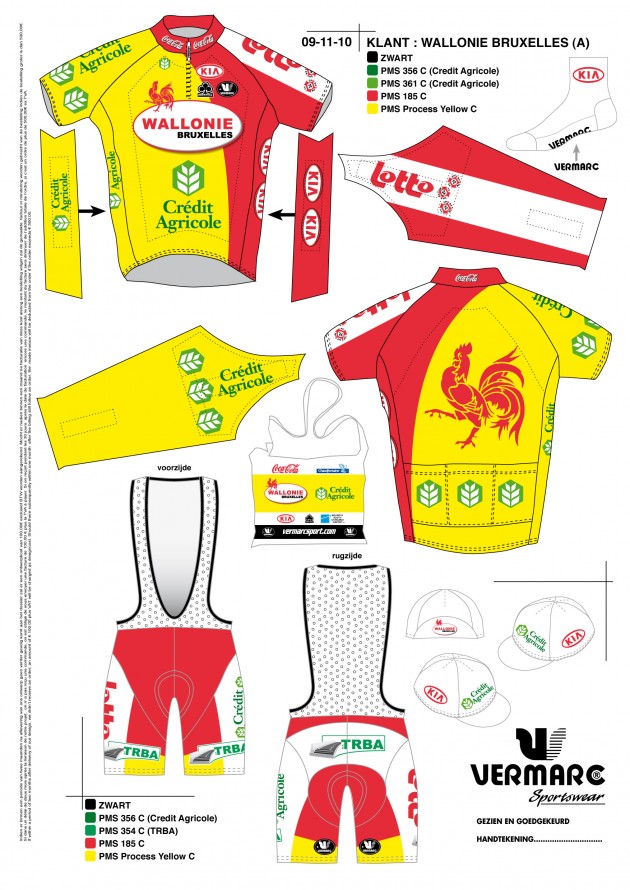
Here’s a first look at the 2011 team kit for the recently-announced Belgian Continental team under the direction of former Motorola rider Michel Dernies, Team Wallonie-Bruxelles. Pretty nice, huh?
-
Recent Posts
Archives
- March 2016
- February 2016
- March 2015
- February 2015
- February 2013
- January 2013
- December 2012
- November 2012
- October 2012
- September 2012
- August 2012
- July 2012
- June 2012
- January 2012
- December 2011
- November 2011
- October 2011
- September 2011
- August 2011
- July 2011
- June 2011
- May 2011
- April 2011
- March 2011
- February 2011
- January 2011
- December 2010
- November 2010
- October 2010
- September 2010
- August 2010
- July 2010
- June 2010
- May 2010
- April 2010
- March 2010
- February 2010
- January 2010
- December 2009
- November 2009
- October 2009
- September 2009
- August 2009
- July 2009
- June 2009
- May 2009
- April 2009
- March 2009
- February 2009


Pingback: 2011 Team Kit First Look – Team Wallonie-Bruxelles: http://www.pavepavepave.com/2010/11/17/2011-team-kit-first-look-team-wallonie-bruxelles/
It looks good. Not too common of a color scheme, which means that when I'm squinting at a video on my computer monitor, they'll stand out. Unlike RadioShack, BMC, and Caisse d'Epargne, whose common red/black scheme makes them all look like each other.
Vraiment horrible! Comment est-il possible de faire encore des maillots aussi affreux en l'an 2010? Le team Wallonie-Bruxelles n'a-t-il jamais entendu parler du métier de graphiste?
Looks like the Spanish national team kit…..